Thanks to guest writer Sally Murdoch for today’s post.
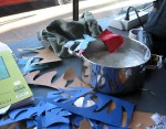
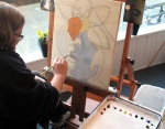
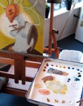
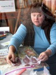
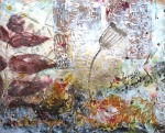
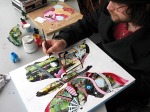
The limelight seems to follow artist Anne Lukas. It may be the irresistible medium of paper maché, or it may be her open disposition, or a combination of both. For example, when two of her dioramas placed as finalists two years in a row for the Washington Post Peeps contest, the online gallery garnered 2 million hits, making it one of the Post’s most viewed galleries ever. Then when she moved to the Pacific Northwest 4 years ago, her reputation as a finalist of the Washington Post peeps diorama contest preceded her, as neighbors already knew who she was. And today, as she layered paper on a mythical creature inspired by a Dr. Seuss sculpture, the Muse storefront was continually filled with people of all ages, swirling with activity and conversing all afternoon.
A native Chicagoan, Anne graduated from Southern Illinois University with a degree in graphic design and worked as a freelancer and for small publishing companies in layout and logo design. Four years ago, she traded in Washington D.C. for Camas, Washington when her husband’s job with Honda Corporation moved her family of four. When she arrived, she saw a need for art classes at the elementary school level. She mentioned this to a fellow mom, which was all it took to gather a roomful of eager students ready to learn art basics. She was off and running as an art teacher within her first year of living in the Pacific Northwest.
Today, the Seussian trophy head was started at home, and shaped into place with coat hangers, newspapers and tape. She then stapled the mythical beast to a wood panel. Dr. Seuss has been a fixture in Lukas’ life as a mom to an 11 and 14 year old, and a constant at Camas elementary schools, one where she was artist in residence and crafted a life-sized zebra with hundreds of children. “Did you know Dr. Seuss was a sculptor?” she asks. Born Theodor Seuss Geisel, his father worked as a zoologist and would bring home horns and antlers that young Ted would fashion into imaginary animals.
She tore strips from Fabriano paper’s Tiziano line, carried at here at Muse. The textured drawing paper is heavier weight with cotton content, making it strong and pliable, and colors that are very fade resistant. Fabriano has been crafting paper since the 1300’s.
Anne learned paper maché technique from one of the founders of Mudeye Puppet Company, who invited her to his studio and showed her the ropes. “I like that the materials are virtually free, the creations are lightweight, that you can make anything out of it, even huge sculptures. The sculpt-ability is amazing.” Plus, she added, it’s great for kids. With cornstarch and water being the bonding element, it’s nontoxic and washes right out of clothing.
Her work with the students at Grass Valley Elementary to build their mascot zebra has inspired her for her next project in which she hopes to make another life-sized animal, complete with innards out of paper maché. Stay tuned for that adventure on Anne’s website.
This summer, Anne and friend Michelle have partnered to host weeklong summer camps, tapping into the duo’s combined areas of expertise in drama, art and theater. Kids entering 3rd grade through middle school are welcome and camps run 9 to 12 and/or 1 to 4 pm weekdays. Four areas will be taught:
1. Paper maché trophy heads
2. Puppet making: Including various media including paper maché
3. Puppeteering: Using made or a supply of puppets
4. Tile mosaics: floor tile and ceramics.
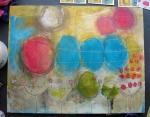
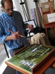
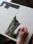
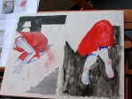
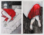
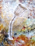
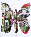
The last picture shows Anne’s sculptural piece at the end of the day Tuesday. UPDATE: The last picture shows Anne’s finished paper mache sculpture.
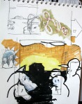
Click on thumbnails to see larger pictures.